How to Space Displayed Mathematical Equations

In a displayed mathematical equation with more than one component, how much space should be placed between the components?

Here are the guidelines I use, with examples in LaTeX. Recall that a \quad is approximately the width of a capital M and \qquad is twice the width of a \quad.

Case 1. Equation with Qualifying Expression

An equation or other mathematical construct is separated from a qualifying expression by a \quad. Examples:

\notag     |a_{ii}| \ge \displaystyle\sum_{j\ne i} |a_{ij}|, \quad i=1\colon n.

\notag       fl(x\mathbin{\mathrm{op}}y) = (x\mathbin{\mathrm{op}} y)(1+\delta), \quad |\delta|\le u,       \quad \mathbin{\mathrm{op}} =+,-,*,/.

\notag    y' = t^2+y^2, \quad 0\le t\le 1, \quad y(0)=0.

When the qualifying expression is a prepositional phrase it is given standard sentence spacing. Examples:

\notag \min_x c^Tx \quad \mathrm{subject~to~} Ax=b,~ x\ge 0.

\notag   \|J(v)-J(w)\| \le \theta_L \|v-w\| \quad   \mathrm{for~all~} v,w \in \mathbb{R}^n.

The first example was typed as (using the equation* environment provided by the amsmath package)

\begin{equation*}
\min_x c^Tx \quad \text{subject to $Ax=b$, $x\ge 0$}.
\end{equation*}

Here, the qualifying phrase is placed inside a \text command, which jumps out of math mode and formats its argument as regular text, with the usual interword spacing in effect, and we re-enter math mode for the conditions. This is better than writing

\min_x c^Tx \quad \text{subject to} ~Ax=b, ~x\ge 0.

with hard spaces. Note that \text is a command from the amsmath package, and it is similar to the LaTeX command \mbox and the TeX command \hbox, both of which work equally well here.

Case 2. Equation with Conjunction

When an equation contains a conjunction such as and or or, the conjunction has a \quad on each side. Examples:

\notag      x = 1 \quad \mathrm{or} \quad x = 2.

\notag      a = \displaystyle\sum_{j=1}^n c_j v_j \quad \mathrm{where} \quad      c_j = \langle a,~ u_j\rangle~\mathrm{for}~j=1,2,\dots,n.

In the second example, one might argue for a \quad before the qualifying “for”, on the basis of case 1, but it I prefer the word spacing. This example was typed as

\begin{equation*}
     a = \sum_{j=1}^n c_j v_j \quad \text{where} \quad
     \text{$c_j = \langle a, u_j\rangle$ for $j=1,2,\dots,n$}.
\end{equation*}

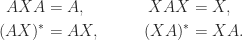
Case 3. Multiple Equations

Two or more equations are separated by a \qquad. Examples:

\notag  A = e_1^{}e_3^T, \qquad  B = e_1^{}e_4^T, \qquad  C = e_2^{}e_3^T, \qquad  D = e_2^{}e_4^T

\notag \begin{aligned}     AXA &= A,  \qquad  & XAX    &= X,\\  (AX)^* &= AX, \qquad  & (XA)^* &= XA. \end{aligned}

Limitations

It is important to emphasize that one might diverge from following these (or any other) guidelines, for a variety of reasons. With a complicated display, or if a narrow text width is in use (as with a two-column format), horizontal space may be at a premium so one may need to reduce the spacing. And the guidelines do not cover every possible situation.

Notes

My guidelines are the same ones that were used in typesetting the Princeton Companion to Applied Mathematics, and I am grateful to Sam Clark (T&T Productions), copy editor and typesetter of the Companion, for discussions about them. Cases 1 and 3 are recommended in my Handbook of Writing for the Mathematical Sciences (2017).

The SIAM Style Guide (link to PDF) prefers a \qquad in Case 1 and \quad in Case 3 with three or more equations. The AMS Style Guide (link to PDF) has the same guidelines as SIAM. Both SIAM and the AMS allow an author to use just a \quad between an equation an a qualifying expression.

In the TeXbook (1986, p. 166), Knuth advocates using a \qquad between an equation and a qualifying expression.

Which Fountain Pen Ink for Writing Mathematics?

If, like me, you sometimes prefer to write mathematics on paper before typing into LaTeX, you have the choice of pencil or pen as your writing tool. I’ve written before about writing in pencil. My current tools of choice are fountain pens.

A fountain pen, the ink it contains and the paper used are three independent variables that combine in a complicated way to affect the experience of writing and the results produced. Here, I focus solely on inks and ask what ink one should choose depending on different mathematics-focused requirements.

I give links to reviews on the excellent Mountain of Ink and Pen Addict websites and other pen/ink websites. Unless otherwise stated, I have tried the inks myself.

191224_inks-1.jpg

Fast Drying Time

When we write down mathematical working, perhaps in the course of doing research, we are likely to need to go back and make changes to what we have just written. A fast drying ink helps avoid smudges, and it also means we can start writing on the reverse side of a page without pausing to let the ink dry or using blotting paper. Left-handed writers may always need such an ink, depending on their particular style of writing. My favourite fast-drying ink is Noodler’s Bernanke Blue, which is named after Ben Bernanke, former chairman of the Federal Reserve. Downsides are feathering (where the ink spreads out to create rough edges) and bleeding (where ink soaks through on the other side of the page) on lesser grades of paper.

Water Resistance

As mathematicians are major consumers of coffee, what we write risks being spilled on. (Indeed this is so normal an occurrence that Hanno Rein has written a LaTeX package to simulate a coffee stain.) An ink should be reasonably water resistant if spills are not to blur what we have written. Many popular inks have poor water resistance. One of the most water resistant is Noodler’s Bulletproof Black, which also “resists all the known tools of a forger, UV light, UV light wands, bleaches, alcohols, solvent…”. It’s great for writing cheques, as well as mathematics. (But it may not be the blackest black ink, if that matters to you.) Another water resistant ink is Noodler’s Baystate Blue (see below).

Interesting Names

Sometimes, writing with an interestingly named pen, paper or ink can provide inspiration. While many Coloverse inks have a space or physics theme, I am not aware of any mathematically named inks.

Vibrant Inks

Vibrant inks are great for annotating a printout or writing on paper with heavy lines, squares or dots. An outstanding ink in this respect is Noodler’s Baystate Blue, an incredibly intense, bright blue that jumps off the page. The downsides are bleeding and staining. An ink to be used with caution! I also like the much better behaved Pilot Iroshizuku Fuyu-gaki (orange) and Pilot Iroshizuku Kon-peki (blue).

191224_inks-2.jpg

For Marking (Grading)

For marking scripts one obviously needs to use a different colour than the student has used. Traditionally, this is red. A couple of my favourites for marking are Waterman Audacious Red and Cult Pens Deep Dark Orange.

Shading, Sheen and Shimmer

Many inks have one or more of the properties of shading, sheen and shimmer. Shading is where an ink appears darker or lighter in different parts of a stroke; sheen is where an ink shines with a different colour; and shimmer is where particles have been added to the ink that cause it to shimmer or glisten when it catches the light. The strength of all these effects is strongly dependent on the pen, the nib size and the paper, and for shimmer the pen needs to be moved around to distribute the particles before writing. (Sheen and shimmer do not show up well on the scans shown in this post.) Among my favourites are Diamine Majestic Blue (blue with purple sheen), Robert Oster Fire and Ice (teal with shading and pink sheen) and Diamine Cocoa Shimmer (brown with gold shimmer). For “monster sheen”, try Organic Studios Nitrogen Royal Blue, but note that it is hard to clean out of a pen.

191224_inks-3.jpg

Nonstandard Surfaces

Much mathematics is written on bar mats, napkins, paper towels, backs of envelopes, newspapers, tablecloths, and anything that is to hand, especially when mathematicians work together away from their desks. These surfaces are not fountain-pen friendly. One promising ink for such situations is Noodler’s X-Feather, which was created to combat feathering on cheap paper. (I have not tried this ink.)

All Rounders

Finally, three good all-round inks that I’ve used a lot when working on my books and papers are Diamine Asa Blue, Diamine Oxford Blue, and Diamine Red Dragon.

191224_inks-4.jpg

Handbook of Writing for the Mathematical Sciences, Third Edition

hwms3_cover_front.jpg

The third edition of Handbook of Writing for the Mathematical Sciences was published by SIAM in January 2020. It is SIAM’s fourth best selling book of all time if sales for the first edition (1993) and second edition (1998) are combined, and it is in my top ten most cited outputs. As well as being used by individuals from students to faculty, it is a course text on transferable skills modules in many mathematics departments. A number of publishers cite the book as a reference for recommended style—see, for example, the AMS Author Handbook, the SIAM Style Manual and, outside mathematics and computing, the Chicago Manual of Style.

Parts of the second edition were becoming out of date, as they didn’t reflect recent developments in publishing (open access publishing, DOIs, ORCID, etc.) or workflow (including modern LaTeX packages, version control, and markup languages). I’ve also learned a lot more about writing over the last twenty years.

I made a variety of improvements for the third edition. I reorganized the material in a way that is more logical and makes the book easier to use for reference. I also improved the design and formatting and checked and updated all the references.

I removed content that was outdated or is now unnecessary. For example, nowadays there is no need to talk about submitting a hard copy manuscript, or one not written in LaTeX, to a publisher. I removed the 20-page appendix Winners of Prizes for Expository Writing, since the contents can now be found on the web, and likewise for the appendix listing addresses of mathematical organizations.

I also added a substantial amount of new material. Here are some of the more notable changes.

hwms1to3spines.jpg
  • A new chapter Workflow discusses how to organize and automate the many tasks involved in writing. With the increased role of computers in writing and the volume of digital material we produce it is important that we make efficient use of text editors, markup languages, tools for manipulating plain text, spellcheckers, version control, and much more.
  • The chapter on \LaTeX has been greatly expanded, reflecting both the many new and useful packages and my improved knowledge of typesetting.
  • I used the enumitem \LaTeX package to format all numbered and bulleted lists. This results in more concise lists that make better use of the page, as explained in this blog post.
  • I wrote a new chapter on indexing at the same time as I was reading the literature on indexing and making an improved index for the book. Indexing is an interesting task, but most of us do it only occasionally so it is hard to become proficient. This is my best index yet, and the indexing chapter explains pretty much everything I’ve learned abut the topic.
  • Since the second edition I have changed my mind about how to typeset tables. I am now a convert to minimizing the use of rules and to using the booktabs \LaTeX package, as explained in this blog post.
  • The chapter Writing a Talk now illustrates the use of the Beamer \LaTeX package.
  • The book uses color for syntax highlighted \LaTeX listings and examples of slides.
  • Sidebars in gray boxes give brief diversions on topics related to the text, including several on “Publication Peculiarities”.
  • An expanded chapter English Usage includes new sections on Zombie Nouns; Double Negatives; Serial, or Oxford, Comma; and Split Infinitives.
  • There are new chapters on Writing a Blog Post; Refereeing and Reviewing; Writing a Book; and, as discussed above, Preparing an Index and Workflow.
  • The bibliography now uses the backref \LaTeX package to point back to the pages on which entries are cited, hence I removed the author index.
  • As well as updating the bibliography I have added DOIs and URL links, which can be found in the online version of the bibliography in bbl and PDF form, which is available from the book’s website.

At 353 pages, and allowing for the appendices removed and the more efficient formatting, the third edition is over 30 percent longer than the second edition.

As always, working with the SIAM staff on the book was a pleasure. A special thanks goes to Sam Clark of T&T Productions, who copy edited the book. Sam, with whom I have worked on two previous book projects, not only edited for SIAM style but found a large number of improvements to the text and showed me some things I did not know about \LaTeX.

SIAM News has published an interview with me about the book and mathematical writing and publishing.

Here is a word cloud for the book, generated in MATLAB using the wordcloud function, based on words of 6 or more characters. wordcloud2.jpg

Palomino Blackwing Pencil Tribute to Ada Lovelace

Despite the deep penetration of digital tools into our lives, a lot of mathematics is still written by hand in pencil, and so it is appropriate that the Palomino Blackwing Volumes 16.2 pencil is a tribute to Ada Lovelace, the 19th century mathematician who worked on Charles Babbage’s proposed Analytical Engine.

The Palomino Blackwing, from California Cedar Products Company, is a modern version of the Blackwing pencil produced up until 1998 by the Eberhard Faber Pencil Company. The Blackwing was a favorite of luminaries such as John Steinbeck and Leonard Bernstein, and was much missed until CalCedar acquired the brand and started production of its own version of the pencil in 2011. Blackwing Volumes are limited editions “celebrating the people, places and events that have defined our creative culture”.

180121-1105-22_7746.jpg

The 16.2 in the volume name refers to the Analytical Engine’s storage capacity of 16.2 kB (enough to hold one thousand 40 decimal digit numbers). The matt white finish and matt black ferrule are “inspired by the simple styling of early personal computers”. The rear of the pencil contains a pattern that represents in binary the initials AAL that Lovelace used to sign her work.

180121-1235-26_7753.jpg

Blackwing pencils are available with four different graphite hardnesses, of which the 16.2 is the second firmest, roughly equivalent to a B, and the same as for the regular Blackwing 602. The following test compares the 16.2 with the Blackwing (no number, and the softest), the Dixon Ticonderoga HB, and the Staedtler Noris HB. The paper is Clairefontaine and the shaded area shows a smear test where I rubbed my thumb over the shaded rectangle.

180121-1106-08_7748.jpg

The pencils come in packs of 12 and are available at, for example Bureau Direct (UK), pencils.com (USA), and JetPens (USA). If you’re in New York City, pop into Caroline Weaver’s wonderful CW Pencil Enterprise store.

One review has suggested that a harder graphite (as in certain other limited editions) would be better for writing mathematics. For me the 16.2 core is fine, but I also enjoy using the softer Blackwing cores. For a mathematician, as for any writer, having to pause to sharpen a pencil is not necessarily a bad thing, especially as the shavings give off a wonderful odor of the California incense cedar from which the barrels are made.

Five Examples of Proofreading

proofs-authors-red.jpg

Every writer has also to be a proofreader, whether it be of his or her own drafts or of proofs sent by a publisher. In this post I will give some real-life examples of corrections to proofs. The problems to be corrected are not all errors: some are subtle aspects of the typesetting that need improvement. These examples should give you some ideas on what to look out for the next time you have a set of proofs to inspect.

Example 1

The first example is from proofs of one of my recent papers:

hist16-proof-line191.jpg

The article had been submitted as LaTeX source and it was reasonable to assume that the only differences between the proofs and what we submitted would be in places where a copy editor had imposed the journal style or had spotted a grammatical error. Fortunately, I know from experience not to make that assumption. These two sentences contain two errors introduced during copy editing: the term “Anderson acceleration” has been deleted after “To apply”, and “We denote by unvec” has been changed to “We denote by vec” (making the sentence nonsensical). The moral is never to assume that egregious errors have not been introduced: check everything in journal proofs.

In a similar vein, consider this extract from another set of proofs:

hino16-proof-line154.jpg

There is nothing wrong with the words or equations. The problem is that an unwanted paragraph break has been inserted after equation (2.6), and indeed also before “Only”. This set of proofs contained numerous unwanted added new paragraphs.

Example 2

Here is an extract from the proofs of my recent SIAM Review paper (with Natasa Strabic and Vedran Sego) Restoring Definiteness via Shrinking, with an Application to Correlation Matrices with a Fixed Block:

hss16-p4-proof.jpg

We noticed that the word “how” appears at the end of a line four times within seven lines—an unfortunate coincidence. We suggested that the production editor insert a hard space in the LaTeX source between one or more of the hows and the following word in order to force different line breaks. Here is the result as published:

hss16-p4-final.jpg

Example 3

What’s wrong with this example, from a paper in the 1980s?

besa89-p193.jpg

The phrase “best unknown” should be “best known”!

Example 4

The next example is from a book:

boyd14-p324.jpg

At first sight there is nothing wrong. But the 9z is suspicious: why 9, and why is this term that depends only on z inside the integral? It turns out that the equation should read

k(z) \equiv \frac{2}{z} \int_0^1 \tanh\bigl( z \sin(2\pi t) \bigr) \sin(2\pi t) \,dt.

When you realize that the left parenthesis and the digit 9 share the same key on the keyboard you can start to see how the error might have been made at the typing stage.

Example 5

The final example (from a 2013 issue of Private Eye) is completely different and illustrates a rare phenomenon:

private_eye_river_text1.jpg

If you cannot see anything wrong after a minute or so, click here. This phenomenon, whereby white spaces in successive lines join up to make a snake, is known as rivers of white. The fix, as in Example 2, is to force different line breaks.

Dot Grid Paper for Writing Mathematics

As I discussed in Writing Mathematics in Pencil, and Why Analogue is Not Dead, there is a lot to be said for writing mathematics on paper, at least for early drafts before the material is typed into LaTeX.

There are essentially four types of paper that you might use.

  • Plain paper. Readily available: you can always raid the printer or photocopier. A plain sheet of paper places no constraints on your writing, but it can make it hard to maintain straight lines and a consistent letter height.
  • Ruled paper. The most popular choice. A drawback is that it may be hard to find the perfect line spacing, which can depend on what you are writing or even what pen you are using.
  • Graph, or quadrille, paper. Although aimed at those needing to draw graphs or designs, this paper can be used for general writing, as long as the lines are not so prominent as to be distracting.

There is a fourth type of paper that is less well known, but is becoming more popular: dot grid paper. This paper contains a rectangular array of dots. It is particularly popular with bullet journal enthusiasts.

Could dot grid paper be the perfect choice for writing mathematics? The dots are sufficient to keep your writing straight, but there is less ink on the page to distract you in the way that rules or a graph pattern can. If you need to draw a diagram or graph then the dots are most likely all the guidance you need. And you can draw boxes through groups of four dots to make a to-do list. As explained on the Baron Fig website, dot grid is “there when you need structure, quiet when you don’t”.

A popular supplier of dot grid paper is Rhodia, whose Dot Pads have lightly printed dots at 5mm intervals. The pads are stapled at the top, with the cover pre-scored in order to help it fold around the back of the pad. They also have micro-perforations that make it very easy to tear a page off. Their paper is much-loved by users of fountain pens for its smooth quality and resistance to bleed-through.

For general comments on dot grid paper from the online stationer Bureau Direct, some great photos, and even a flowchart (written on dot grid of course), see 3 Reasons To Switch To Dot Paper.

Here is a sample of mathematics written on Rhodia dot grid paper, using a Tombow Mono 100 4B pencil.

dotgrid-notes.jpg

Of course, you can generate your own dot grid paper with suitable LaTeX code. The following code is adapted from this post on Reddit; it produces this A4 sheet.

\documentclass{article}
\pagenumbering{gobble}
\usepackage[a4paper,hmargin={0mm,3mm},vmargin=5mm]{geometry}  
\usepackage{tikz}
\begin{document}
  \begin{tikzpicture}[scale=.5]
    \foreach \x in {0,...,41}
    \foreach \y in {0,...,57}
    {
  \fill[gray!75] (\x,\y) circle (0.06cm);
    }       
  \end{tikzpicture}
\end{document}

Give dot grid paper a try. It could be just what you need to unleash your mathematical (or other) creativity.

Writing Mathematics in Pencil, and Why Analogue is Not Dead

It’s an old joke that mathematicians need just a pencil, paper, and a bin, while philosophers are even more frugal because they don’t need the bin. Yet nowadays more and more of the time of mathematicians, indeed all scientists, is spent at the computer. Whereas twenty years ago I would handwrite a draft of a paper before typing it in, I now do almost all the drafting directly in \LaTeX at the keyboard.

But in response to computers dominating our lives, and in a move away from the (mythical?) paperless office, people are increasingly reverting to analogue tools, encouraged by the pleasure of handling stationery and, for those of us who were brought up in an analogue world, nostalgia.

This is a good time to employ retro tools in a digital world because we can now buy online an increasingly wide variety of stationery from all around the world.

What might you gain by writing mathematics with a pencil and paper as opposed to typing it at the computer? Sitting at a desk with a pencil in hand you are free from the distractions of the windows on your computer screen. The analogue process, with its delays of turning a page, sharpening the pencil, and rubbing out mistakes, has the benefit of slowing you down and thereby promoting your flow of thought and creativity. And the touch of the paper and the smell of cedar as you sharpen the pencil refresh the senses.

161209-2045-01-5702-cropped.jpg
CW Pencil Enterprise, New York, “purveyor of superior graphite, etc.”

Donald Knuth has another reason for writing with a pencil, as explained in this 2008 interview.

I love keyboards, but my manuscripts are always handwritten. The reason is that I type faster than I think. There’s a synchronization problem. I can think of ideas at about the rate I can write them down with a pencil. But with typing I’m going faster, so I have to sync, and my thoughts have to start up and stop again in a way that involves more of my brain.

Yet more reasons for using pencils are given in the video Why Use Pencils? by T. J. Cosgrove. One of T. J.’s points is that the graphite produced by a pencil does not fade, unlike inks.

It is also worth noting that in some recently published research psychologists found evidence that students who take notes with pencil (or pen) and paper outperform those who take notes on a laptop.

So there are some good reasons for writing with a pencil. How should you choose one from among the many different types available?

I don’t know of a good source of advice on pencils for mathematicians (maybe I will write something in due course), but this blog post on pencils for musicians is largely applicable if you replace “music” by “mathematics”. The post is by Caitlin Elgin, from the wonderful Manhattan pencil shop pictured in the photo above, which I took when I visited it last year.

Hyphenation of Compound Words

Compound words are common in mathematical writing and it can be hard to remember how to hyphenate them. Unfortunately, there are no hard and fast rules. In this article I give some guidance and illustrative examples. The principle to keep in mind is that hyphenation should help to avoid ambiguity.

In phrases of the form “adjective noun noun” or “noun adjective/participle noun” a hyphen is usually used: closed-form solution, nineteenth-century mathematics, error-correcting code. But if the adjective follows the noun then no hyphen is needed: solution in closed form, mathematics of the nineteenth century, code that is error correcting. Here are some other examples:

  • nearest-neighbor interpolation,
  • higher-dimensional discrete Fourier transforms,
  • large-scale optimization problem,
  • minimum-norm solution but solution of minimum norm,
  • first-order differential equation but differential equation of first order,
  • the parameter-dependent ODE but the ODE is parameter dependent,
  • rank-1 matrix but the matrix has rank 1.

In examples such as finite-difference method and finite-element method it is a matter of convention and taste whether to hyphenate. Some authors do and some don’t. Most authors do not hyphenate singular value decomposition.

Compounds beginning with adverbs ending in ly are not hyphenated, since they are usually unambiguous. Examples: slowly converging sequence, highly oscillatory integrand, continuously differentiable function, numerically oriented examples.

An important special case is compounds beginning with ill, well, little, much, and best, the first two of which are particularly common in mathematical writing. Here, a hyphen is used for a compound of two words used adjectivally, but if the compound itself is modified then no hyphen is used. Examples (these also apply with ill replaced by well):

  • This is an ill-conditioned problem.
  • This is a very ill conditioned problem.
  • The problem is ill conditioned.
  • This problem is very ill conditioned.

If the first example were to be written as This is an ill conditioned problem then it could be read as if ill were an adjective modifying the compound conditioned problem. Confusion is unlikely in this instance, but in ill-prepared contestant the hyphen is needed unless we are talking about a contestant who is prepared but not well.

Here are two further examples that are complete sentences.

  • MATLAB allows a two-dimensional array to be subscripted as though it were one dimensional.
  • This approach is particularly well-suited to high-precision computation.

The hyphen in well-suited in the last example is not essential, but is rather a matter of taste.

I know from personal experience that it is hard to achieve good, consistent hyphenation when you are concentrating on all the other aspects of writing. This is where having the services of a copy editor is extremely valuable. To benefit, you need to publish with a journal or book publisher that takes copy editing seriously (SIAM, PUP, CUP, OUP, …).

I give the final word to an Oxford University Press style manual, as quoted in the Economist Style Guide:

If you take hyphens seriously, you will surely go mad.

I am indebted to Sam Clark of T&T Productions for checking this post (and for saving me from many hyphenation blunders in my last two books).

Hyphenation Question: Row-wise or Rowwise?

Sam Clark of T&T Productions, the copy editor for the third edition of MATLAB Guide (co-authored with Des Higham and to be published by SIAM in December 2016), recently asked whether we would like to change “row-wise” to “rowwise”.

A search of my hard disk reveals that I have always used the hyphen, probably because I don’t like consecutive w’s. Indeed, in 1999 I published a paper Row-Wise Backward Stable Elimination Methods for the Equality Constrained Least Squares Problem .

A bit more searching found recent SIAM papers containing “rowwise”, so it is clearly acceptable usage to omit the hyphen..

My dictionaries and usage guides don’t provide any guidance as far as I can tell. Here is what some more online searching revealed.

  • The Oxford English Dictionary does not contain either form (in the entry for “row” or elsewhere), but the entry for “column” contains “column-wise” but not “columnwise”.
  • The Google Ngram Viewer shows a great prevalence of the hyphenated form, which was about three time as common as the unhyphenated form in the year 2000.
  • A search for “row-wise” and “rowwise” at google.co.uk finds about 724,000 and 248,00 hits, respectively.
  • A Google Scholar search for “row-wise” and “rowwise” finds 31,600 and 18,900 results, respectively. For each spelling, there are plenty of papers with that form in the title. The top hit for “rowwise” is a 1993 paper The rowwise correlation between two proximity matrices and the partial rowwise correlation, which manages to include the word twice for good measure!

Since the book is about MATLAB, it also seemed appropriate to check how the MATLAB documentation hyphenates the term. I could only find the hyphenated form:

doc flipdim:
When the value of dim is 1, the array is flipped row-wise down

But for columnwise I found that MATLAB R2016b is inconsistent, as the following extracts illustrate, the first being from the documentation for the Symbolic Math Toolbox version of the function.

doc reshape:
The elements are taken column-wise from A ...
Reshape a matrix row-wise by transposing the result.

doc rmmissing:
1 for row-wise (default) | 2 for column-wise

doc flipdim:
When dim is 2, the array is flipped columnwise left to right.

doc unwrap:
If P is a matrix, unwrap operates columnwise.

So what is our conclusion? We’re sticking to “row-wise” because we think it is easier to parse, especially for those whose first language is not English.

Acronymous Thoughts

According to the Concise Oxford English Dictionary (COD, 11th ed., 2004), “An acronym is a word formed from the initial letters of other words”. Here are some well-known examples.

  • AIDS: acquired immune deficiency syndrome,
  • laser: light amplification by stimulated emission of radiation,
  • radar: radio detection and ranging,
  • scuba: self-contained underwater breathing apparatus,
  • snafu: situation normal all fouled up,
  • sonar: sound navigation and ranging,
  • UNESCO: United Nations Educational, Scientific, and Cultural Organization,
  • WYSIWYG: what you see is what you get.

There is even a recursive acronym, GNU, standing for “GNU’s not Unix”.

ID-10096639.jpg
Image courtesy of smarnad at FreeDigitalPhotos.net.

On close inspection, the OED definition is imprecise in two respects. First, can we take more than one letter from each word? The definition doesn’t say, but the examples radar and sonar make it clear that we can. Second, do we have to take the initial letters from the words in their original order. This is clearly the accepted meaning. Merriam Webster’s Collegiate Dictionary (10th ed., 1993) provides a more precise definition that covers both points, by saying “formed from the initial letter or letters of each of the successive parts or major parts of a compound term”.

In common with many fields, applied mathematics has a lot of acronyms. It also has a good number of the most elegant of acronyms: those that take exactly one letter from each word, such as

  • BLAS: basic linear algebra subprograms,
  • DCT: discrete cosine transform,
  • FSAL: first same as last,
  • MIMO: multi-input multi-output,
  • NaN: not a number,
  • PDE: partial differential equation,
  • SIRK: singly-implicit Runge-Kutta,
  • SVD: singular value decomposition.

New acronyms are regularly formed in research papers. Non-native speakers are advised to be careful in doing so, as their constructions may have unsuspected meanings. The authors of this article in Chemical Communcations managed to get two exceptionally inappropriate acronyms into print, and one wonders how these escaped the referees and editor.

Another question left open by the definitions mentioned above is whether an acronym has to be pronounceable. The big Oxford English Dictionary (3rd ed., 2015) lists two meanings, which allow an acronym to be pronounceable or unpronounceable. The New York Times Manual of Style and Usage (5th ed., 2015) says “unless pronounced as a word, an abbreviation is not an acronym”, while the Style Guide of The Economist (11th ed., 2015) also requires pronounceability, as do various other references.

Apart from SIAM (Society for Industrial and Applied Mathematics), not many mathematics societies have pronounceable acronyms. In the “pronounced by letter” camp we have, for example,

  • AMS: American Mathematical Society
  • AWM: Association for Women in Mathematics
  • EMS: European Mathematical Society
  • IMA: Institute of Mathematics and its Applications
  • IMU: International Mathematical Union
  • LMS: London Mathematical Society
  • MAA: Mathematical Association of America
  • MPS: Mathematical Programming Society

SIAM’s founders chose well when they named the society in 1952! Indeed the letters S, I, A, M have proved popular, forming in a different order the acronyms of the more recent bodies SMAI (La Société de Mathématiques Appliquées et Industrielles) and AIMS (the African Institute for Mathematical Sciences).

A situation where (near) acronyms are particularly prevalent is in research proposals, where a catchy acronym in the title is often felt to be an advantage. I suspect that in many cases the title is chosen to fit the acronym. Indeed there is now a word to describe this practice. In 2015 the OED added the word backronym (first occurrence in 1983), which refers to “a contrived explanation of an existing word’s origin, positing it as an acronym”. One backronym is “SOS”; see Wikipedia and this article by John Cook for more examples.

The Acronym Finder website does a good job of finding the meaning of an acronym, often returning multiple results. For SIAM it produces 17 definitions, of which the “top hit” is the expected one—and at least one is rather unexpected!